Bar Charts show data on a graph. The graph will have axes and labels. the horizontal axis will show the items, while the vertical axis will show the frequency. The bars are normally displayed vertically, but may be displayed horizontally (in which case the axes are switched).
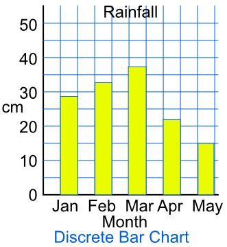
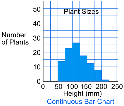
A gap between the bars indicates that the data is discrete. Bars touching each other show that the data is continuous.
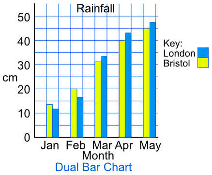
More than one set of data can be placed on a graph. The data is placed side-by-side in pairs (Dual Bar Charts, or Comparative Bar Charts). Add a key to the graph to identify the different bars.
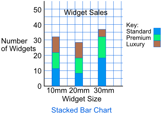
A Stacked Bar Chart will display bars on top of one another. The stacked bars must be related to one another.
The data below shows the average temperature for Newcastle between January and June. Draw a Bar Chart with this data.
| Jan | Feb | Mar | Apr | May | Jun |
| 3ºC | 4ºC | 6ºC | 7ºC | 9ºC | 12ºC |
Points to note on the graph:
The data is discrete; there is a gap between each bar;
The horizontal scale shows months, and is labelled;
The vertical scale shows the temperature, and is labelled
Answer: 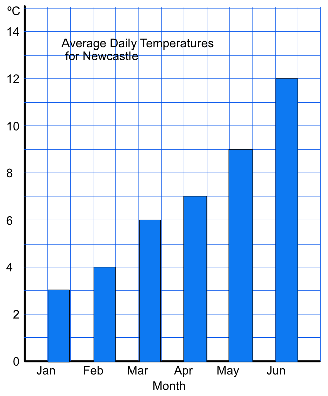
The bar chart below shows the average daily temperatures for Bristol and Dubai. In which month is the greatest temperature difference between the two cities?
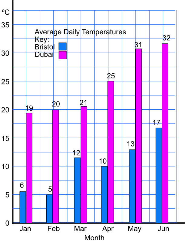
Using the scales, work out the temperature for each city for each month, and subtract for the difference:
eg Jan: 19 - 6 = 13º, Feb: 20 - 5 = 15º, etc
Answer: May