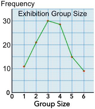
A Line Graph will plot frequency against a changing value, such as time. It is used for Ungrouped Data. Points should be plotted using the values provided. Only points that are plotted are joined.
This example shows the number of people in each group arriving at an exhibition:
| Group Size | Frequency |
|---|---|
| 1 | 12 |
| 2 | 22 |
| 3 | 30 |
| 4 | 27 |
| 5 | 15 |
| 5 | 8 |
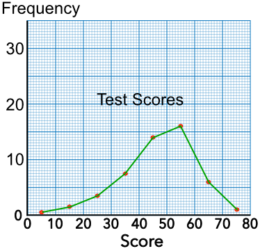
A Frequency Polygon is a line graph that plots the frequency of grouped data. The points plotted are the middle value of the class interval and the frequency.
This example shows the result of a test undertaken by some maths students. The frequency polygon is plotted for this data:
| Score | Frequency | Midpoint | Plotted Value |
|---|---|---|---|
| 0 < m ≤ 10 | 1 | 5 | (5, 1) |
| 10 < m ≤ 20 | 3 | 15 | (15, 3) |
| 20 < m ≤ 30 | 7 | 25 | (25, 7) |
| 30 < m ≤ 40 | 15 | 35 | (35, 15) |
| 40 < m ≤ 50 | 28 | 45 | (45, 28) |
| 50 < m ≤ 60 | 32 | 55 | (55, 32) |
| 60 < m ≤ 70 | 12 | 65 | (65, 12) |
| 70 < m ≤ 80 | 2 | 75 | (75, 2) |
The number of widgets manufactured at a factory was plotted against the number of hours into the shift. In which hour was the highest number of widgets produced?
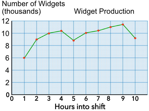
Find the highest value on the graph. Read the hour from the horizontal axis.
Answer: The 9th hour
From the graph, above, how many widgets had been produced after three hours?
Work out the values for the first three hours: 6, 9 and 10.
Add the values together = 25
These are in thousands, so 25,000
Answer: 25,000 widgets