A graph shows how one set of information interacts with another. The graph to be plotted is normally given as a table of values.For a straight line, at least three points are required. Plot the points, and draw a line through the points. If the line is curved, more points need to be plotted.
Set out consistent scales; that is, the distance between intervals must be regular. Label the axes, indicating any units being used. In some instances it may be necessary to plot two lines on the graph to compare values.
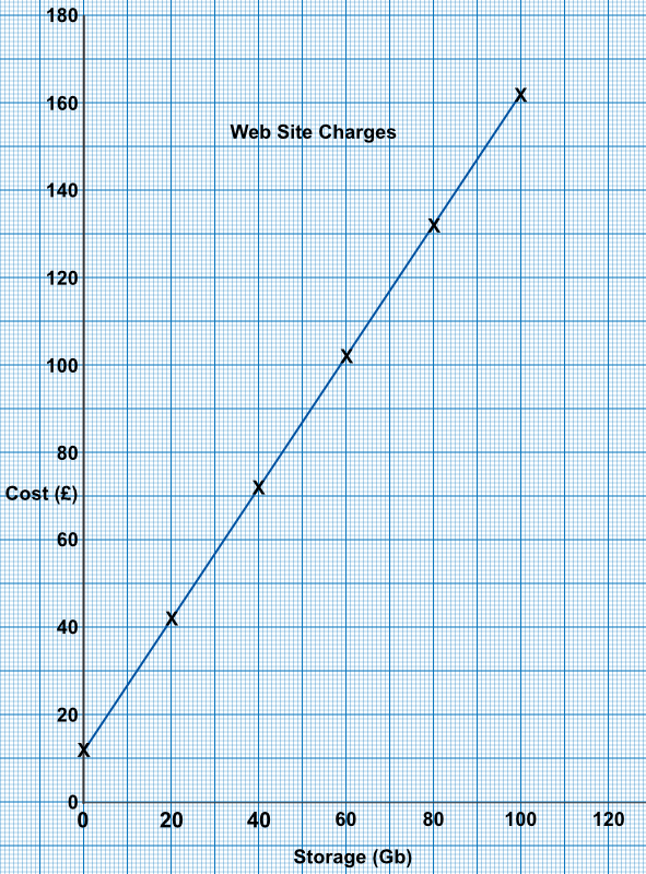
A web site charges £12 per month for a website, plus £1.50 for each Gb of data stored on the website. Plot a graph showing the cost of running a web site with the amount of data ranging from 0 Gb to 100 Gb.
Create a small table with some calculated values
If there is no data, then only the case cost is needed £12
For 20GB, it is £12 + £1.50 x 20 = £42 etc
| Gb | 0 | 20 | 40 | 60 | 80 | 100 |
| Cost (£) | 12.00 | 42.00 | 72.00 | 102.00 | 132.00 | 162.00 |
Answer:
Two electricity suppliers are shown on the graph, below. If I use 10000 kilowatts per year, how much will I save using New Plasma rather than Bright Spark?
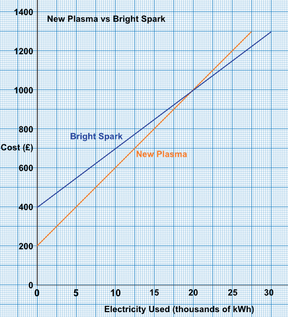
Read across to 10 on the graph (which is 10 000).
Read up to the New Plasma line for a cost of £600.
Read up to Bright Sparks for a cost of £700.
The saving is £700 - £600 = £100.
Answer: £100
See also Plotting Graphs of Straight Lines