A Scatter Graph shows how two sets of data may be related. Note that, on a scatter graph, the points are not joined up.
The relationship between the two sets of data is known as the Correlation. There are three types of correlation:
If one value increases as the other also increases, then this is a Positive Correlation;
If one value falls as the other increases, then this is a Negative Correlation;
If there is no link between the two sets of data, then there is No Correlation

Note that an increase in one value does not necessarily cause the other value to change: for example, a good result in a Maths test does not cause a good result in a History test.
A teacher wanted to know whether the performance in a test was linked to the distance the student travelled to school. The teacher obtained the following results:
| Distance (km) | Test Score |
|---|---|
| 0.1 | 45 |
| 0.1 | 65 |
| 0.2 | 28 |
| 0.3 | 76 |
| 0.5 | 55 |
| 0.6 | 48 |
| 0.9 | 64 |
| 1.1 | 41 |
| 1.5 | 30 |
| 1.8 | 52 |
| 1.8 | 75 |
| 1.9 | 35 |
| 2.1 | 42 |
| 2.2 | 65 |
| 3.0 | 30 |
| 3.6 | 71 |
By plotting a scatter diagram, or otherwise, indicate the nature of the correlation between the distance the student lives from school, and the results in a test.
The plotted graph indicates there is no strong link between the two pieces of data.
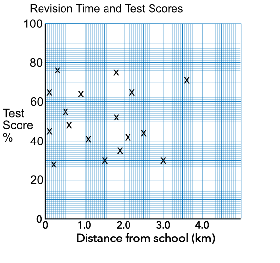
Answer: No correlation
A survey examined the relationship between the amount of time spent revising for a test, and the results of a test. The information is shown on a scatter graph, below. What is the relationship between revision and test scores?
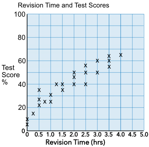
As the time spent revising increased, the test score increased.
Answer: Positive correlation