A Pie Chart shows data as sectors of a circle. A pie chart is built from a table of data.
Building a pie chart consists of these steps:
• Add the frequencies to obtain a total;
• Divide 360º by the total (to get the number of degrees for one item);
• Multiply each frequency by this number;
• Plot the pie chart using these values;
• Label the pie chart and provide a title
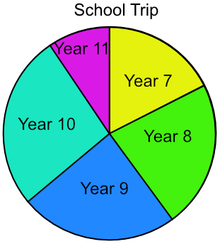
A school is taking 120 students on a trip. The students come from several year groups. Plot a pie chart to represent the data.
| Frequency | |
| Year 7 | 21 |
| Year 8 | 27 |
| Year 9 | 29 |
| Year 10 | 32 |
| Year 11 | 11 |
Add frequencies for total = 120.
Each student is worth 360 ÷ 120 = 3º
Multiply each frequency by 3º
| Frequency | ||
| Year 7 | 21 | 3º x 21 = 63 |
| Year 8 | 27 | 3º x 27 = 81 |
| Year 9 | 29 | 3º x 29 = 87 |
| Year 10 | 32 | 3º x 32 = 96 |
| Year 11 | 11 | 3º x 11 = 33 |
| Totals | 120 | 360º |
Plot the chart, adding a title and labels
Answer:
The pie chart below shows the type of cars sold by a car showroom over one month. 18 5-door cars were sold. How many SUVs were sold?
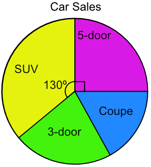
18 five-door cars = 90º
1 car = 90 ÷ 18 = 5º for each car
SUVs = 130º ÷ 5 = 26 cars
Answer: 26