A graph that shows Time Series Data is a plot of value against time, with time shown along the bottom of the graph.
More than one set of data may be plotted on a graph: for example, plotting a comparison of rainfall between two different places.
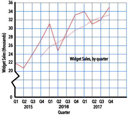
Time series data can be used to determine a Moving Average that smooths out the peaks and troughs of a graph so that any trend, or movement, can be determined. A moving average uses the mean of the number of periods: for example, a three-month moving average will add the values for three consecutive months and divide by 3. A moving average can only be plotted when the number of periods in the moving averages are available.
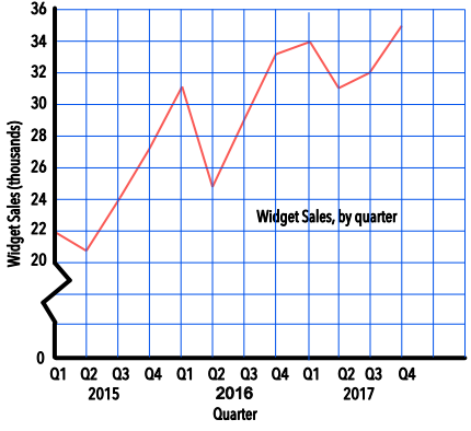
The sales of widgets are noted on a table for each Quarter over the previous three years. Plot the time series on a graph.
(A quarter is a period of three months eg the first quarter in a year is January-February-March)
| Quarter | 2015 Q1 | 2015 Q2 | 2015 Q3 | 2015 Q4 | 2016 Q1 | 2016 Q2 |
| Widgets (thousands) | 22 | 21 | 24 | 27 | 31 | 25 |
| Quarter | 2016 Q3 | 2016 Q4 | 2017 Q1 | 2017 Q2 | 2017 Q3 | 2017 Q4 |
| Widgets (thousands) | 29 | 33 | 34 | 31 | 32 | 35 |
Remember to title the graph, and to name the axes and provide scales.
Answer:
For the sales of widgets, above, plot the 4-quarter moving average on the same graph.
Moving average for 2015 Q4 = (22 + 21 + 24 + 27) ÷ 4 = 23.5
Moving average for 2016 Q1 = (21 + 24 + 27 + 31) ÷ 4 = 25.8
Moving average for 2016 Q2 = (24 + 27 + 31 + 25) ÷ 4 = 26.7 etc..
| Quarter | 2015 Q1 | 2015 Q2 | 2015 Q3 | 2015 Q4 | 2016 Q1 | 2016 Q2 |
| Widgets (thousands) | 22 | 21 | 24 | 27 | 31 | 25 |
| 4Q Moving Average | 23.5 | 25.8 | 26.7 | |||
| Quarter | 2016 Q3 | 2016 Q4 | 2017 Q1 | 2017 Q2 | 2017 Q3 | 2017 Q4 |
| Widgets (thousands) | 29 | 33 | 34 | 31 | 32 | 35 |
| 4Q Moving Average | 28.0 | 29.5 | 30.3 | 31.8 | 32.5 | 33.0 |
Answer:
See also Mean