A histogram is a specialized form of a bar chart. Data on a histogram is grouped together, with the groups being collected in specific ranges known as class intervals.
On a bar chart, the height of the bar gives the frequency. On a histogram, the area of the bar represents the frequency, rather than the height.
The height of each histogram bar is calculated by dividing the frequency by the class Width. This height is called the Frequency Density. Where the class intervals are all the same, the height of the chart is in direct proportion to the frequency.
The speed of cars passing a point on the road was recorded over a period of one hour. The data was plotted on a histogram. From the histogram, below, determine the number of cars that were driving between 20mph and 40mph.
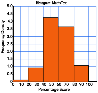
The width of the class interval is 20 (10mph).
The frequency density for 20 < s ≤ 40 is 0.9
0.9 x 20 = 18 cars
Answer: 18 cars
The table below shows the amount that customers spent at a local shop. A histogram is to be plotted for this data. What is the value of frequency density for the class interval £0 < S ≤ £5?
| Amount | Frequency |
| 0 < h ≤ 5 | 48 |
| 5 < h ≤ 10 | 32 |
| 10 < h ≤ 15 | 15 |
| 15 < h ≤ 20 | 17 |
| 20 < h ≤ 25 | 8 |
| 25 < h ≤ 30 | 4 |
The frequency for this class is 48.
The class interval is 5.
Frequency density = `frac(text(frequency))(text(class interval))` = 48 ÷ 5 = 9.6
Answer: 9.6